Brainstorming & Sketch Modeling
Our initial brainstorm session focused on one question: What story do we want to tell? We knew that a museum exhibit is, above all, an experience and a narrative for visitors. What was the most compelling? What was the most important?
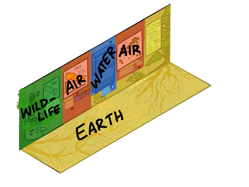
We ended up splitting the exhibit into four sections: Water, Earth, Air, and Wildlife.
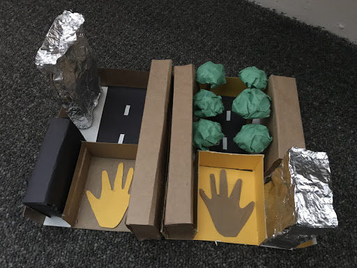
Pictured below, left: A 3D prototype of a possible heat island demo. Visitors can put their hands on the two panels and feel the difference in temperature between a road with and without trees.
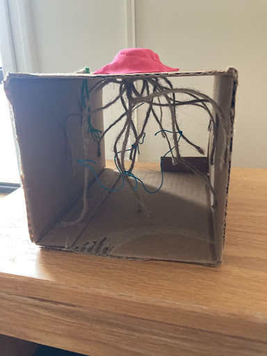
Pictured below, right: A prototype of a possible root system display, showing roots and the fungi that interconnect them into a network.
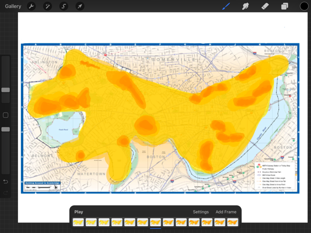
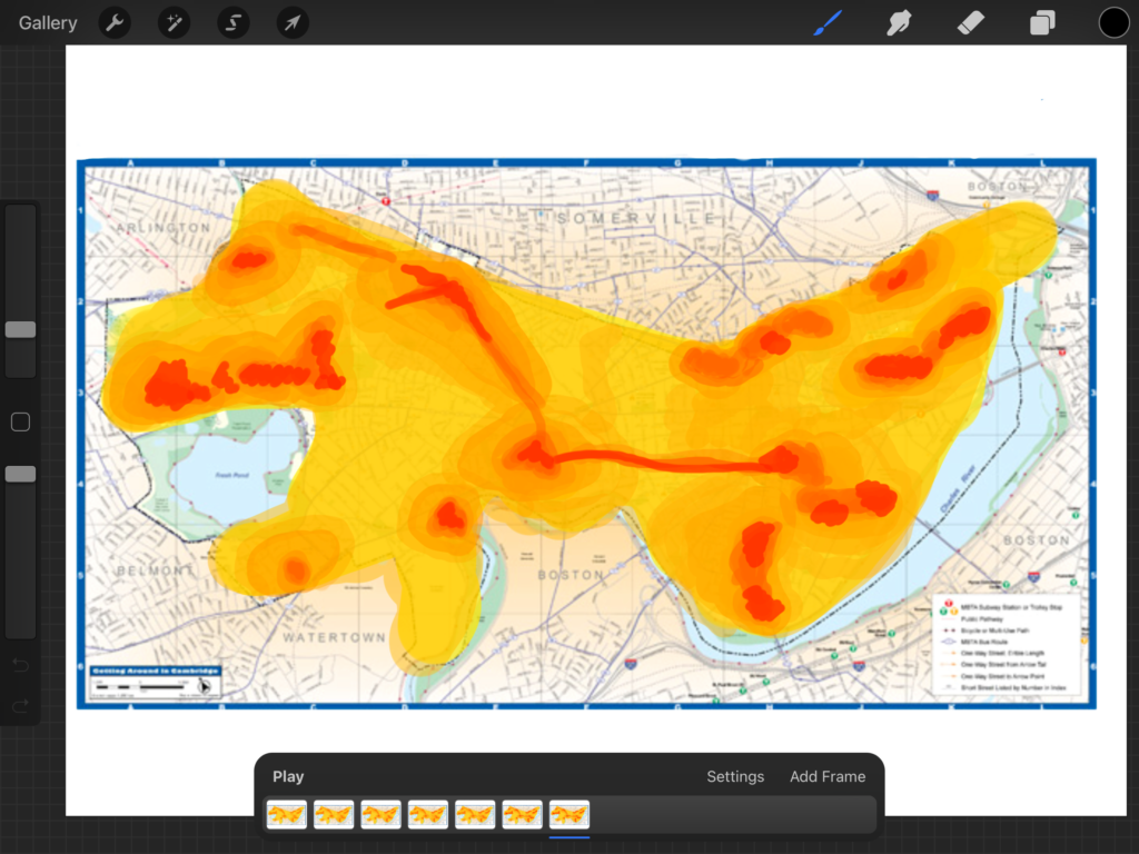
This is a sketch animation of one of the interactive heat maps that could be in the display. The user would be able to slide a timeline and view the heat islands in Cambridge changing over time.
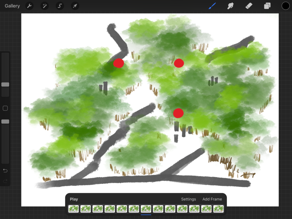
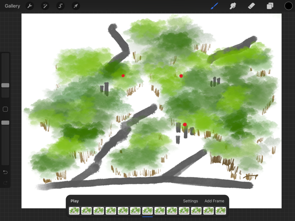
This is the animation for the carbon sequestration interactive demo. The user would be able to tap to spawn carbon dioxide and adjust the amount of trees present with a slider to see how quickly the carbon dioxide would be sequestrated.
Iterations
Below are very early ideas for how to illustrate our stories included a table-like exhibit of the 3D topography of Cambridge, with LED lights that could turn on and off to show motion or changes over time. However, after talking with Jess Smith from the team at the MIT Welcome Center, we knew that our exhibit would first be shown on a peg board. We began to plan for a more upright display.
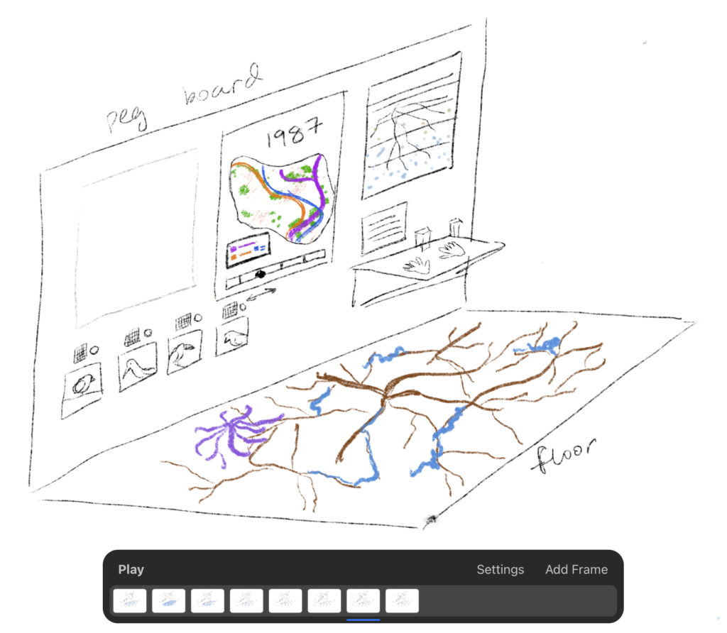
Our very first concept sketch features a map that can display wildlife patterns and heat islands, an animated cross section of a root network that shows water flowing down, a version of Lai Wa’s touch display of urban heat, an animated projection of a root network on the ground, and buttons for common Cambridge bird calls.
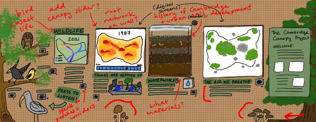
By our second iteration, we had split the wildlife and heat island displays into two separate maps, changed the root cross section into a glass enclosure displaying Cambridge soil, made the bird display more engaging, and split the exhibit more clearly into different topics. Marked up in red are notes that we took down while talking to Laura Tenny, our science consultant.
Our current design expands on the previous visualization, includes the pictured projection of the root network onto the ground, and implements Laura’s suggestions for the canopy slider in the heat map as well as the scale of the soil cross section.

